Creating Pivot Table Chart in Excel: Clear Steps, Shortcut Keys, and Practical Examples
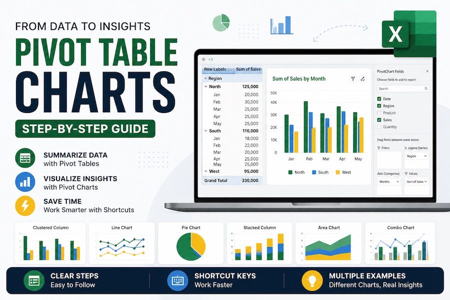
Creating a Pivot Table Chart in Excel is one of the easiest ways to turn a normal spreadsheet into a useful report. A PivotTable summarizes your data, and a PivotChart turns that summary into a visual chart. The best part is that you do not need to build every formula, chart range, and summary manually.
In this guide, you will see exactly how your data should look before creating a PivotChart, which fields to place in the PivotTable, the step-by-step instructions to follow, useful Excel shortcut keys, and several practical Pivot Table Chart examples with table layouts and chart previews.
Simple idea: First prepare a clean source table, then create a PivotTable, then insert a PivotChart from that PivotTable.
Quick Workflow: Source Table to PivotTable to PivotChart
A Pivot Table Chart in Excel works best when you follow a simple order. Do not start with the chart first. Start with clean data, create the PivotTable, and then create the PivotChart.
How to Prepare Your Excel Data Before Creating a PivotChart
Your source data should be arranged like a simple database table. Each column needs one clear heading, and each row should represent one transaction, sale, order, task, expense, or record.
The full PivotTable result tables are shown later in the examples, and each one is followed by the chart created from that result. Before you build those examples, make sure your source data follows these rules.
Clean data rules before creating a Pivot Table Chart
- Use one header row only. Do not use multiple heading rows above your data.
- Do not merge cells. Merged cells can break PivotTable grouping and filtering.
- Keep numbers as numbers. Revenue, Cost, Units, and Profit should not be stored as text.
- Keep dates as real Excel dates. If dates are stored as text, monthly grouping may not work.
- Remove blank rows and blank columns. Blank areas can make Excel select the wrong data range.
- Convert the range into an Excel Table. Click inside the data and press Ctrl + T.
Best practice: After pressing Ctrl + T, give your table a clear name such as SalesData. When new rows are added, the table expands automatically, and your PivotTable can include the new data after refresh.
Excel Shortcut Keys for Creating Pivot Table Charts
These shortcut keys make the process faster. For ribbon shortcuts such as Alt, N, V, press the keys one after another, not all at the same time.
| Action | Shortcut Key | What It Does |
|---|---|---|
| Create an Excel Table | Ctrl + T | Turns your selected data range into a structured Excel Table. |
| Select current data region | Ctrl + A | Selects the current table or data range when your cursor is inside the dataset. |
| Insert PivotTable | Alt, N, V | Opens the PivotTable command from the Insert tab in many Windows versions of Excel. |
| Create quick chart | Alt + F1 | Creates an embedded chart from the selected PivotTable or selected data. |
| Create chart on new sheet | F11 | Creates a chart sheet from selected data or a selected PivotTable. |
| Open filter drop-down | Alt + Down Arrow | Opens a filter menu, useful for PivotTable row labels and column labels. |
| Open right-click menu | Shift + F10 | Useful for grouping dates, changing value settings, sorting, and refreshing. |
| Format selected item | Ctrl + 1 | Opens the Format dialog for cells, chart elements, and axis formatting. |
| Refresh current PivotTable | Alt + F5 | Refreshes the selected PivotTable and connected PivotChart. |
| Refresh all data | Ctrl + Alt + F5 | Refreshes all PivotTables and data connections in the workbook. |
Ribbon shortcuts can vary slightly by Excel version, language, and operating system. If a shortcut does not work, use the menu path shown in the steps.
Step-by-Step: How to Create a Pivot Table Chart in Excel
Here is the clean beginner-friendly process for creating a Pivot Table Chart in Excel.
-
Step 1: Click inside your source data.
Your data should have clear headers such as Date, Region, Product, Revenue, and Profit. -
Step 2: Convert the data into an Excel Table.
Press Ctrl + T, confirm that “My table has headers” is checked, and click OK. -
Step 3: Insert the PivotTable.
Go to Insert > PivotTable, or use Alt, N, V. -
Step 4: Choose where to place the PivotTable.
Select New Worksheet for a clean report page. This is usually the best option. -
Step 5: Arrange the PivotTable fields.
Drag fields into Rows, Columns, Values, and Filters. For example, place Region in Rows and Revenue in Values. -
Step 6: Check the PivotTable result.
Make sure Excel is showing Sum of Revenue, not Count of Revenue. If it shows Count, your number column may contain blanks or text. -
Step 7: Insert the PivotChart.
Click inside the PivotTable, then go to PivotTable Analyze > PivotChart. You can also try Alt + F1 for a quick embedded chart. -
Step 8: Choose the right chart type.
Use a column chart for comparisons, a line chart for trends, a bar chart for rankings, and a combo chart when comparing two measures. -
Step 9: Format the chart.
Add a clear chart title, format numbers, sort values, add data labels if needed, and hide unnecessary PivotChart field buttons. -
Step 10: Refresh when data changes.
Use Alt + F5 to refresh the selected PivotTable and PivotChart.
Pivot Table Chart Examples in Excel
Each example below follows the same structure: what the source table should contain, where to place fields in the PivotTable, the exact steps, the expected PivotTable result, and the matching chart preview created from that result.
Example 1: Revenue by Region Pivot Table Chart
This is the most common PivotChart example. It shows which region generated the most revenue.
Best chart type Clustered Column Chart or Bar Chart
Source table should include these columns
| Date | Region | Revenue |
|---|---|---|
| 03-Jan-2026 | East | 3,000 |
| 05-Jan-2026 | West | 1,080 |
| 08-Jan-2026 | North | 1,200 |
| 12-Jan-2026 | South | 1,100 |
PivotTable field placement
| PivotTable Area | Field |
|---|---|
| Rows | Region |
| Values | Sum of Revenue |
| Columns | Leave empty |
| Filters | Optional: Salesperson or Category |
Clear steps
- Click inside the source table and press Ctrl + T.
- Go to Insert > PivotTable, or press Alt, N, V.
- Drag Region into the Rows area.
- Drag Revenue into the Values area.
- Make sure the value says Sum of Revenue.
- Click inside the PivotTable and go to PivotTable Analyze > PivotChart.
- Choose Clustered Column and click OK.
Expected PivotTable result
| Region | Sum of Revenue |
|---|---|
| East | 8,190 |
| West | 4,410 |
| North | 3,720 |
| South | 2,860 |
| Grand Total | 19,180 |
How the chart should look
Example 2: Monthly Revenue Trend Pivot Table Chart
Use this PivotChart when you want to see sales movement over time. A line chart is usually the best choice for monthly trends.
Best chart type Line Chart
Source table should include these columns
| Date | Revenue |
|---|---|
| 03-Jan-2026 | 3,000 |
| 02-Feb-2026 | 1,440 |
| 01-Mar-2026 | 3,750 |
PivotTable field placement
| PivotTable Area | Field |
|---|---|
| Rows | Date, grouped by Months |
| Values | Sum of Revenue |
| Recommended Grouping | Months and Years |
Clear steps
- Create the PivotTable from your Excel Table.
- Drag Date into the Rows area.
- Drag Revenue into the Values area.
- Right-click any date in the PivotTable, or press Shift + F10.
- Choose Group, then select Months and Years.
- Insert a PivotChart and choose Line Chart.
Expected PivotTable result
| Month | Sum of Revenue |
|---|---|
| Jan 2026 | 6,380 |
| Feb 2026 | 5,390 |
| Mar 2026 | 7,410 |
| Grand Total | 19,180 |
How the chart should look
If grouping does not work: Your dates may be stored as text. Convert them into real Excel dates before creating the PivotTable.
Example 3: Revenue by Product Category Pivot Table Chart
This PivotChart shows which product category contributes the most revenue. It is useful for product analysis, sales planning, and management reports.
Best chart type Column Chart, Bar Chart, or Doughnut Chart
PivotTable field placement
| PivotTable Area | Field |
|---|---|
| Rows | Category |
| Values | Sum of Revenue |
| Filters | Optional: Region or Month |
Clear steps
- Insert a PivotTable from the source table.
- Drag Category into Rows.
- Drag Revenue into Values.
- Sort the values from largest to smallest.
- Insert a PivotChart and choose a column, bar, or doughnut chart.
Expected PivotTable result
| Category | Sum of Revenue |
|---|---|
| Electronics | 12,780 |
| Furniture | 3,480 |
| Office Supplies | 2,920 |
| Grand Total | 19,180 |
How the chart should look
Example 4: Top 5 Products Pivot Table Chart
A Top Products PivotChart is useful when you have many products and want to show only the highest performers.
Best chart type Bar Chart
PivotTable field placement
| PivotTable Area | Field |
|---|---|
| Rows | Product |
| Values | Sum of Revenue |
| Value Filter | Top 5 by Sum of Revenue |
Clear steps
- Create a PivotTable.
- Drag Product into Rows.
- Drag Revenue into Values.
- Open the Row Labels drop-down with Alt + Down Arrow.
- Choose Value Filters > Top 10.
- Change 10 to 5 and select Top 5 Items by Sum of Revenue.
- Insert a PivotChart and choose Bar Chart.
Expected PivotTable result
| Product | Sum of Revenue |
|---|---|
| Laptop | 9,000 |
| Monitor | 3,780 |
| Printer | 2,420 |
| Desk Chair | 2,280 |
| Desk | 1,200 |
How the chart should look
Example 5: Revenue by Region and Category Pivot Table Chart
This example uses both rows and columns in the PivotTable. It shows how much each category contributed inside each region.
Best chart type Stacked Column Chart
PivotTable field placement
| PivotTable Area | Field |
|---|---|
| Rows | Region |
| Columns | Category |
| Values | Sum of Revenue |
Clear steps
- Create the PivotTable from your Excel Table.
- Drag Region into Rows.
- Drag Category into Columns.
- Drag Revenue into Values.
- Insert a PivotChart and select Stacked Column.
- Add a clear chart title such as Revenue by Region and Category.
Expected PivotTable result
| Region | Electronics | Furniture | Office Supplies | Grand Total |
|---|---|---|---|---|
| East | 8,190 | 8,190 | ||
| West | 3,330 | 1,080 | 4,410 | |
| North | 2,400 | 1,320 | 3,720 | |
| South | 1,260 | 1,600 | 2,860 |
How the chart should look
Example 6: Salesperson Performance Pivot Table Chart
Use this PivotChart to compare salespeople by total revenue. It works well for weekly, monthly, or quarterly sales reports.
Best chart type Bar Chart
PivotTable field placement
| PivotTable Area | Field |
|---|---|
| Rows | Salesperson |
| Values | Sum of Revenue |
| Filters | Optional: Month, Region, or Category |
Clear steps
- Insert a PivotTable.
- Drag Salesperson into Rows.
- Drag Revenue into Values.
- Sort from largest to smallest.
- Insert a PivotChart and choose Bar Chart.
- Optional: Add Region or Month as a slicer.
Expected PivotTable result
| Salesperson | Sum of Revenue |
|---|---|
| Maria | 8,190 |
| James | 4,410 |
| Aisha | 3,720 |
| Daniel | 2,860 |
How the chart should look
Example 7: Units and Revenue Combo Pivot Table Chart
A combo PivotChart is helpful when you want to compare two different measures, such as total revenue and total units sold. Because revenue and units use different scales, put one measure on a secondary axis.
Best chart type Combo Chart
PivotTable field placement
| PivotTable Area | Field |
|---|---|
| Rows | Product |
| Values | Sum of Revenue |
| Values | Sum of Units |
Clear steps
- Create a PivotTable.
- Drag Product into Rows.
- Drag Revenue into Values.
- Drag Units into Values.
- Insert a PivotChart and choose Combo.
- Set Revenue as a column chart.
- Set Units as a line chart on the secondary axis.
Expected PivotTable result
| Product | Sum of Revenue | Sum of Units |
|---|---|---|
| Laptop | 9,000 | 12 |
| Monitor | 3,780 | 21 |
| Printer | 2,420 | 11 |
| Desk Chair | 2,280 | 19 |
| Desk | 1,200 | 4 |
| Paper | 500 | 20 |
How the chart should look
Example 8: Profit by Category Pivot Table Chart
Revenue is not always enough. A product category may have high sales but lower profit. This PivotChart focuses on profit instead of only revenue.
Best chart type Column Chart
Source table should include a Profit column
Profit = Revenue - CostIn an Excel Table, the formula can look like this:
=[@Revenue]-[@Cost]PivotTable field placement
| PivotTable Area | Field |
|---|---|
| Rows | Category |
| Values | Sum of Profit |
Clear steps
- Add a Profit column to the source table.
- Use the formula
=[@Revenue]-[@Cost]. - Create a PivotTable from the updated table.
- Drag Category into Rows.
- Drag Profit into Values.
- Insert a PivotChart and choose Clustered Column.
Expected PivotTable result
| Category | Sum of Profit |
|---|---|
| Electronics | 3,225 |
| Furniture | 1,160 |
| Office Supplies | 1,080 |
| Grand Total | 5,465 |
How the chart should look
Example 9: Profit Margin Pivot Table Chart
Profit margin shows the percentage of revenue that remains as profit. This is helpful when you want to compare profitability, not just total sales.
Best chart type Column Chart or Bar Chart
Formula to calculate margin
Add a helper column named Margin in your source table:
=IFERROR([@Profit]/[@Revenue],0)Format the result as a percentage.
PivotTable field placement
| PivotTable Area | Field |
|---|---|
| Rows | Category |
| Values | Average of Margin |
Important: Average of Margin is simple and useful for beginners, but it may not always match weighted margin. For a more accurate category margin, compare Sum of Profit ÷ Sum of Revenue.
Expected PivotTable-style result
| Category | Sum of Revenue | Sum of Profit | Profit Margin |
|---|---|---|---|
| Electronics | 12,780 | 3,225 | 25.2% |
| Furniture | 3,480 | 1,160 | 33.3% |
| Office Supplies | 2,920 | 1,080 | 37.0% |
How the chart should look
More Pivot Table Chart Examples You Can Create
Once you understand the pattern, you can create many different Pivot Table Charts in Excel. Use this quick reference table for more ideas.
| Report Question | Rows | Columns | Values | Best Chart |
|---|---|---|---|---|
| Which month had the highest sales? | Date grouped by Month | None | Sum of Revenue | Line Chart or Column Chart |
| Which product sold the most units? | Product | None | Sum of Units | Bar Chart |
| Which region is most profitable? | Region | None | Sum of Profit | Column Chart |
| How does each salesperson perform by category? | Salesperson | Category | Sum of Revenue | Stacked Column Chart |
| What is the sales split by category? | Category | None | Sum of Revenue | Doughnut Chart |
| How many orders were placed each month? | Date grouped by Month | None | Count of Product or Count of Order ID | Column Chart |
| Which products have high revenue but low margin? | Product | None | Sum of Revenue and Margin | Combo Chart |
| How do sales compare by year and quarter? | Quarter | Year | Sum of Revenue | Clustered Column Chart |
Useful Formulas Before Creating Pivot Table Charts
PivotTables can summarize data, but helper columns often make your PivotCharts more useful. Add these formulas to your source table before creating the PivotTable.
Revenue formula
=[@Units]*[@[Unit Price]]Profit formula
=[@Revenue]-[@Cost]Profit margin formula
=IFERROR([@Profit]/[@Revenue],0)Month formula
=TEXT([@Date],"mmm yyyy")Year formula
=YEAR([@Date])Quarter formula
="Q"&ROUNDUP(MONTH([@Date])/3,0)| Helper Column | Why Use It? | PivotChart Example |
|---|---|---|
| Revenue | Calculates total sale value from Units and Unit Price. | Revenue by Region |
| Profit | Shows how much money remains after cost. | Profit by Category |
| Margin | Shows profit as a percentage of revenue. | Profit Margin by Product |
| Month | Makes monthly reporting easier when date grouping is not working. | Monthly Sales Trend |
| Quarter | Groups dates into Q1, Q2, Q3, and Q4. | Quarterly Revenue Chart |
How to Add Slicers to a Pivot Table Chart
Slicers make your PivotChart interactive. Instead of opening filter menus, users can click buttons to filter the chart by Region, Category, Salesperson, Month, or Year.
-
Click inside the PivotTable or PivotChart.
This activates PivotTable tools in Excel. -
Go to PivotTable Analyze > Insert Slicer.
Choose a field such as Region, Category, or Salesperson. -
Select the slicer field and click OK.
Excel adds clickable filter buttons to the worksheet. -
Use the slicer to filter the chart.
Click East, West, Electronics, Furniture, or any other slicer item to update the PivotChart.
Dashboard tip: To connect one slicer to multiple PivotCharts, right-click the slicer, choose Report Connections, and select the PivotTables you want it to control.
How to Refresh a Pivot Table Chart in Excel
When you add new rows or change existing data, your PivotChart may not update immediately. You need to refresh the PivotTable.
| Refresh Method | Shortcut or Menu | Use When |
|---|---|---|
| Refresh selected PivotTable | Alt + F5 | You only need to update the active PivotTable and connected PivotChart. |
| Refresh all PivotTables | Ctrl + Alt + F5 | Your workbook has multiple PivotTables, PivotCharts, or data connections. |
| Refresh from ribbon | Data > Refresh All | You prefer using Excel menus instead of shortcut keys. |
Remember: If your source data is an Excel Table, new rows are included automatically in the table range. You still need to refresh the PivotTable to update the chart.
Common Pivot Table Chart Problems and Fixes
| Problem | Likely Reason | Fix |
|---|---|---|
| PivotChart does not include new rows | The source range did not expand or the PivotTable was not refreshed. | Use Ctrl + T to convert the source range into an Excel Table, then press Alt + F5. |
| Revenue shows as Count instead of Sum | The Revenue column contains text, blanks, or mixed values. | Clean the Revenue column and make sure all values are numeric. |
| Dates do not group by month | Dates are stored as text or the Date column has blank cells. | Convert the column to real Excel dates and remove blank date cells. |
| Chart is too crowded | Too many products, categories, or labels are shown. | Use Top 10 filters, slicers, or a bar chart instead of a crowded column chart. |
| Field buttons make the chart look messy | Excel displays PivotChart field buttons by default. | Right-click a field button and choose Hide All Field Buttons on Chart. |
| One chart changes when another PivotTable is changed | Multiple charts may depend on the same PivotTable layout. | Use a separate PivotTable for each important PivotChart in a dashboard. |
Best Practices for Creating Pivot Table Charts in Excel
- Use clean source data. Good PivotCharts start with clean tables.
- Convert the data to an Excel Table. Press Ctrl + T before creating the PivotTable.
- Choose the right chart type. Column charts are good for comparisons, line charts for trends, and bar charts for rankings.
- Use clear chart titles. A title like “Revenue by Region” is better than “Chart 1”.
- Sort your PivotTable before charting. Sorting makes ranking charts easier to read.
- Use slicers for dashboards. Slicers make reports more interactive and easier for users.
- Refresh before sharing. Press Ctrl + Alt + F5 before sending the workbook.
- Keep each chart focused. One PivotChart should answer one main question.
Frequently Asked Questions About Creating Pivot Table Charts in Excel
What is a Pivot Table Chart in Excel?
A Pivot Table Chart, also called a PivotChart, is a chart connected to a PivotTable. The PivotTable summarizes the data, and the PivotChart shows that summary visually.
What is the easiest way to create a Pivot Table Chart?
The easiest method is to convert your data into an Excel Table with Ctrl + T, insert a PivotTable, place fields in Rows and Values, then insert a PivotChart from the PivotTable.
Which shortcut key creates a PivotTable in Excel?
On many Windows versions of Excel, you can press Alt, N, V to start inserting a PivotTable. You can also use Insert > PivotTable.
Which shortcut key refreshes a PivotTable Chart?
Press Alt + F5 to refresh the selected PivotTable and its connected PivotChart. Press Ctrl + Alt + F5 to refresh all PivotTables and data connections.
Why is my PivotChart not updating?
Your PivotChart may not update because the PivotTable has not been refreshed or the new data is outside the source range. Convert the source data into an Excel Table, then refresh the PivotTable.
Which chart type is best for a PivotTable Chart?
Use a column chart for category comparisons, a line chart for time trends, a bar chart for rankings, a stacked column chart for category breakdowns, and a combo chart for comparing two different measures.
Can I use formulas with Pivot Table Charts?
Yes. Add helper columns such as Revenue, Profit, Margin, Month, Year, and Quarter before creating the PivotTable. These formulas make your PivotCharts easier to build and understand.
Final Thoughts
Creating a Pivot Table Chart in Excel becomes simple when you follow the right order: prepare a clean table, convert it with Ctrl + T, insert a PivotTable, arrange the fields, and then create the PivotChart. Once you understand how Rows, Columns, Values, and Filters work, you can build many reports from the same dataset.
Start with simple charts such as revenue by region or monthly sales trends. Then try more advanced PivotCharts such as Top 5 products, stacked region-by-category charts, combo charts, and profit margin charts. With slicers, refresh shortcuts, and clean helper formulas, Pivot Table Charts can become the foundation of a powerful Excel dashboard.